There are a million ways on how to design your email for your contacts. And to be honest, it can get frustrating. You need a powerful subject line, an engaging header, easy-to-read content, and generally an appealing email.
Today, we’ll be looking and critiquing at one email. We’ll be seeing the good, the bad, and the ugly. This will also give you a better understanding when creating your own email.
The email is from Flywheel. Flywheel is a managed WordPress hosting service for designers, freelancers, and agencies. But if you have a WordPress website and want to get the ultimate experience in hosting, you can check them out.
Check their página web out and learn more about their services!
Enough of that, let’s get into their email.

Sleek, right? We’ll look at what they’re offering, who is their audience, how they convey the message, and why they’re sending this email. Get your pen and paper… or your iPad… and let’s do this.
The Subject Line is the Gateway
Let’s start from the top – the subject line: “Get 3 months of FREE WordPress hosting!”
If that doesn’t catch your attention, then I don’t know what will. Getting free products or services is a great way to get to know the company and what they have to offer. And if you’re not satisfied, you can always cancel your subscription.
Getting the reader’s attention with “FREE” and “3 months of hosting” is enough to peek inside.
Although, with subject lines, you tend to avoid words like FREE. But in this case, we know that is not FREE forever. It’s more like a demo or a trial.
Our eyes are drawn to words like free instead of demo or trial. So, well-done Flywheel, well done.
From looking at the subject line, we can already answer two of our questions of Who, and What.
Who is the audience? Flywheel is targeting Buyer Personas that are in the Consideration Stage of the Buyer’s Journey. So, people are considering buying website hosting services for themselves.
What are they offering? Flywheel is offering 3 months of free WordPress hosting! Not bad, if I say so myself.
Now that they got our attention, let’s click on the email and see what’s inside.
The Header is the Attention Grabber
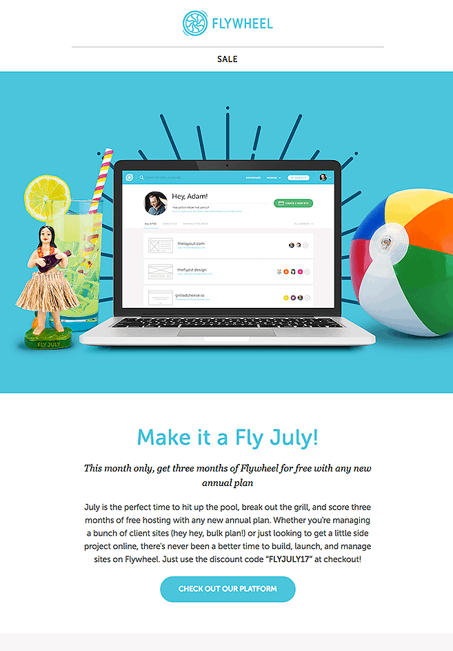
Right off the bat, we can tell is a summer-themed email with a limited time deal – Make it a Fly July.
The artwork is lively, colorful, and it screams “summer”. Though, it does lack engagement and does not show any expectations such as emotion, results, or environment.
They got the theme down, but I would attempt for a more inviting artwork that shows a story or an emotion.
Now let’s get into the copy of the header.
“Make it a Fly July!
This month only, get three months of Flywheel for free with any new annual plan
July is the perfect time to hit up the pool, break out the grill, and score three months of free hosting with any new annual plan. Whether you’re managing a bunch of client sites (hey hey, bulk plan!) or just looking to get a little side project online, there’s never been a better time to build, launch, and manage sites on Flywheel. Just use the discount code “FLYJULY17″ at checkout!”
The copy focuses on their limited time deal of getting 3 free months of hosting for any new annual plan.
They also mention Bulk Plans which Flywheel suggests that they can handle several client sites. Pretty handy for full-time web developers!
But we can make this copy a little more engaging. Let’s show more in fewer words.
Can we do this? Let’s see.
Draft #1
“Make it a Fly July!
This month only, get three months of Flywheel for free with any new annual plan.
Use the discount code “FLYJULY17” and start hitting up the pool, breaking out the grill, and managing sites like a real surfer pro. There’s never been a better time to manage a bunch of sites or to launch your new side project.”
Draft #2
“Make it a Fly July!
This month only, get three months of Flywheel for free with any new annual plan.
Start July with a piña colada on one hand and a fully hosted WordPress website on the other. Get three months of free hosting with any new annual plan by using the discount code “FLYJULY17”. Ready to hit the pool and break out the grill soon? Not until you host your website now!”
Read all three copies and let me know in the comments which of the three you were more engaged with. Feel free to write your own draft and leave it in the comments as well! It’s all about knowing your audience and writing the right words to get them excited.
At the end of the copy, there is a Call to Action (CTA) button that sends them to their website.
The flow of the header is quick and straight to the point. Which is exactly what you should strive for. That’s the way uh-huh I like it!
Moving on with the content of the email!
The Meat and Potatoes
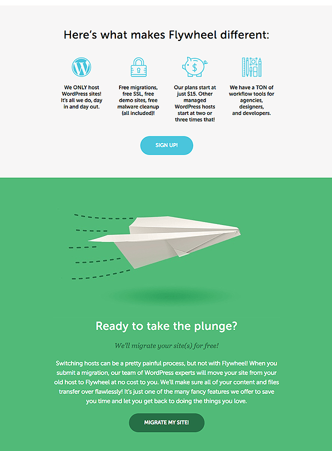
We are now introduced with four icons and copy underneath them. The title of this section reads “Here’s what makes Flywheel different”.
They show us features of what the readers can expect if they do choose to go with Flywheel. In short, this is what they offer:
- WordPress hosting expertise
- Free migrations, free SSL, free demo sites, and free malware checkup
- Low-cost subscription (compared to the others that offer 2 or 3 times more)
- Tool versatility for different Buyer Personas
If you’re experienced with different hosting services, you understand that these features are a plus!
It also makes Flywheel stand out from the competition with low cost and free features.
If that wasn’t convincing enough, Flywheel shows one last section regarding migration.
The artwork is of a paper plane soaring through the green background. Below that, there is some copy about the migration process and what to expect from it.
Is this the most optimized copy? You know what that means. Let’s write some drafts!
Draft #1
“Ready to take the plunge?
We’ll migrate your site(s) for free!
Yes, you read that right. We’ll migrate your site from your old host to Flywheel for free! No need to worry about missing files or content. We’ll take care of your site’s information and transfer it over like a puppy in a basket. Like what we do? It’s one of many awesome things that we offer to give you time and let you do what you love to do.”
Draft #2
“Ready to take the plunge?
We’ll migrate your site(s) for free!
Sit back and relax while we chauffeur you and your website for free to the best WordPress hosting server. Our experts will make sure to transfer all your content and files professionally. Think of it like transferring luggage to your own private jet. It’s one of many services that we offer to have you feeling relaxed and stress-free.”
Like earlier, read all three copies and let me know in the comments which were the most engaging for you. And if you like, you can write your own copy as well!
And again, this section ends with a CTA to submit your migration.
Now, for this section, I would say that the font color of the subheading “We’ll migrate your site(s) for free!” is almost meshing with the background.
Bold it and it will do the trick. Or maybe change the color of it. The point is to have it as legible as possible for the reader at a first glance.

Final Thoughts
Let’s talk about the email as a whole and how does it perform for most readers out there.
The layout and artwork of the email do have a summer feel to it, which is what the header suggests.
The copy of the email can be a bit more engaging and creative to keep the reader’s attention.
More relevant copy.
Less fluff.
Copywriting is like art. It can be subjective to a lot of people. But copywriting is also a skill. Follow a framework to achieve the most out of your copy.
Let’s continue.
The last two CTAs also suggest that the email is targeting several Buyer Personas at the same time. This is a type of goal that you can set for your campaigns. Be careful to not target too many people at the same time.
Let’s meet the Buyer Personas, shall we?
Meet Dave, the inspired freelancer that wants to create a website and store his portfolio online. He has a part-time job in a local café and earns roughly $35,000 a year. Which CTA would Dave click on first?
Yep, you guessed it, or I hope you did. Dave would most likely get the discount code and click on the first CTA of the email. Easy enough, right? Let’s continue.
Meet Veronica, the experienced entrepreneur that owns an online store selling handmade purses. She works full time with her business and earns roughly $50,000 a year. Which CTA would Veronica click on first?
This is a trick question because she would click on the first one. Or does she?
She types the discount code somewhere, so she won’t forget it. She continues with the email and finds the last section to be interesting. “We’ll migrate your site for free.” It was almost like a weight was lifted off her shoulders. Nothing is more daunting than transferring your website to another hosting provider.
She immediately clicks on the last CTA.
It’s always good to define your Buyer Personas. That way you’ll have a better idea of your goals, email design, and copy.
Alright, now the grand finale. I’ve always liked ratings or reviews. It provides an idea or perspective on what to expect.
So, let’s rate this email. 1 being the worst email in the history of the internet and 10 being the perfect email that every person in that audience will fall for.
Flywheel’s Make it Fly July email gets a…
7.5 out of 10
Great formatting, relevant colors, easy to read, good copy, and straight-to-the-point information.
If you want to get good at creating emails, try doing these kinds of exercises. Find an email that you think is good or that needs a drastic makeover. And then ask yourself, what can I do to make it better?
If you need help, send us an email and we’ll make a quick critique!

